Introduction
The "White Cube" aesthetic, the clinical, stark-white gallery look, has dominated art display since the 1930s. However, what works for the Museum of Modern Art rarely translates to a living room. For the residential collector, the best wall color for hanging paintings is not a default choice: it is a strategic decision involving Light Reflectance Value (LRV) and the science of simultaneous contrast. Most homeowners find that their artwork looks washed out or lost because they chose a paint that competes with the canvas rather than supporting it.
This guide moves beyond the sterile gallery myth to teach you how to use rich, intentional colors to make your artwork truly luminous. You will learn how to manipulate undertones and finishes to ensure your investment, whether a thrifted landscape or a contemporary abstract, becomes the undisputed focal point of the room. By understanding how light interacts with pigment and wall surface, you can transform a simple room into a professional-grade personal gallery.
Quick Answer / Key Takeaway
Prioritize matte finishes: Always use flat or matte paint behind art to eliminate glare and light halos that distract from the piece.
The LRV rule: Use low Light Reflectance Value (LRV) colors, which are darker tones, to make light colors in a painting appear brighter and more vivid.
Warm whites over pure whites: In residential lighting (2700K to 3000K), use warm whites like Benjamin Moore White Dove to avoid a dingy, gray appearance.
The 60-30-10 rule: Treat the wall as the 60% dominant color and the artwork as the 10% accent: the wall should be a complementary backdrop, not a competitor.
Art Display Decision Matrix: Color vs. Impact
Wall style | Best for | Key benefit | Recommended finish |
|---|---|---|---|
Warm Gallery White | Eclectic gallery walls and modern abstracts | Provides a clean, crisp backdrop without feeling clinical | Matte / Flat |
Moody Jewel Tones | Oil paintings and gold-framed portraits | Creates "Simultaneous Contrast," making art glow | Ultra-Matte |
Mid-Tone Greige | B&W photography and charcoal sketches | Neutralizes the background so white mats pop | Flat |
Earthy Muted Green | Landscapes and botanical prints | Mimics nature: acts as a grounding natural backdrop | Matte |
The Science of Perception: LRV and Simultaneous Contrast
To choose the best wall color for hanging paintings, you must understand Light Reflectance Value (LRV). This scale runs from 0 to 100, where 0 is absolute black, and 100 is pure white. High LRV walls, such as those painted in bright, reflective whites, bounce light in every direction. This often creates a distracting glare on the glass of a frame or the varnish of an oil painting. When the wall is too bright, the eye struggles to focus on the nuances of the artwork because the surrounding surface is competing for visual attention.
The most effective way to make artwork pop is to apply Michel Eugène Chevreul’s 19th-century theory of simultaneous contrast. Chevreul, a French chemist, discovered that the brain perceives colors differently based on the colors that surround them. If you place a painting with bright yellow highlights on a dark navy wall, the yellow will appear significantly more luminous than if it sat on a white wall. The dark background forces the lighter pigments to advance visually. This contrast creates a sense of depth and vibration that makes the art feel alive. By selecting a paint with a lower LRV, you provide a visual "anchor" that allows the lighter and more vivid tones of the canvas to float forward.
Moving Beyond the "White Cube" Myth
Why pure white fails in residential settings
The "White Cube" concept originated in the 1930s at the Museum of Modern Art (MoMA). It was designed to isolate art from the outside world, creating a vacuum where the object was the only thing that mattered. Critic Brian O'Doherty famously examined this in the 1970s, noting how the white wall turns the gallery into a sacred, non-residential space. The problem arises when we try to bring this into a home. Most modern houses use LED or incandescent bulbs that lean warm, typically between 2700K and 3000K.
When you apply a "ceiling white" or an untinted "gallery white" in these conditions, the paint often takes on a cold, shadowy, or even slightly blue-gray cast in the corners. This happens because pure white lacks the necessary pigments to bounce warm residential light effectively. Instead of a crisp backdrop, you end up with a wall that looks unfinished or clinical, which drains the energy from your artwork.
The Warm "Residential Gallery" White
For a home, a warm white is almost always superior to a blue-toned white. Warm whites contain microscopic amounts of yellow, red, or gray pigment that harmonize with standard home lighting. These tones create a "breathable" space that feels open but not cold.
Benjamin Moore 'White Dove' (OC-17) is the gold standard for this application. It has an LRV of approximately 83, meaning it reflects a significant amount of light, but its soft, creamy undertones prevent it from feeling like a refrigerator. It provides enough contrast for black frames to look sharp while remaining subtle enough that it does not overwhelm delicate watercolors or sketches. When you use a warm white, you are not just painting a wall: you are creating a soft light box that supports the art without the harshness of a commercial gallery.
The Case for Dark and Moody Backdrops
Creating the Luminous Effect
While white is the traditional choice, deep and saturated colors often provide a more professional result for residential collectors. Colors like navy, charcoal, and forest green have low LRVs that cause the wall to recede visually. When the wall moves "back," the artwork appears to move "forward." This is the secret behind the displays at the Louvre and the Metropolitan Museum of Art, where curators often use deep crimson or midnight blue for Renaissance and Baroque galleries.
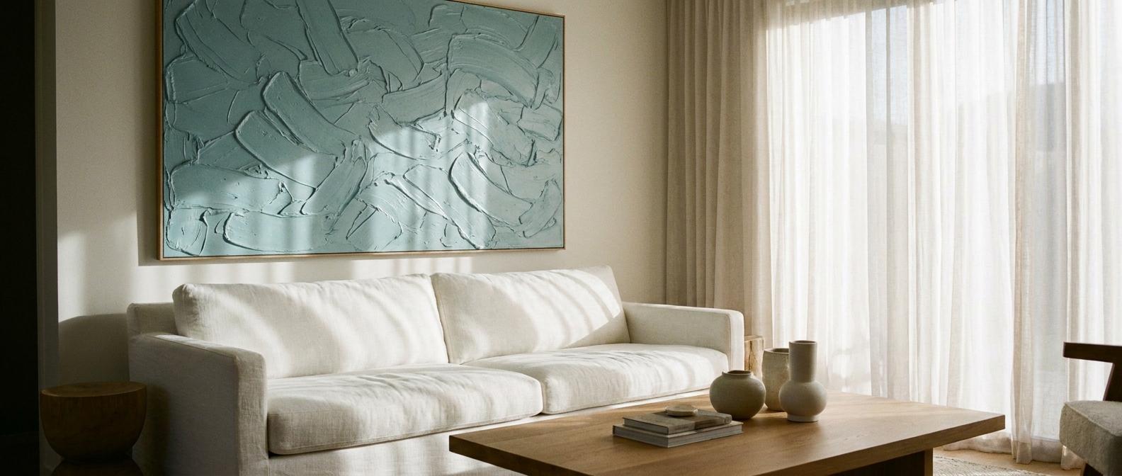
These dark colors absorb excess light, which eliminates the "halo" effect often seen around frames on light walls. When you use a color like Farrow & Ball 'Hague Blue' (No. 30), the deep blue-green pigments provide a rich foundation. This specific depth makes the oil pigments in a painting look more saturated. It is particularly effective for contemporary abstracts with neon or bright primary colors, as the dark background provides a stark contrast that makes the colors look like they are glowing from within.
Pairing Frames with Deep Tones
Dark walls also change the way we perceive frames. On a white wall, a gold or brass frame can sometimes look gaudy or disconnected. On a dark, moody backdrop, those same gold tones become a highlight. The dark paint provides a "weight" that balances the metallic sheen. This is a hallmark of the "Dark Academia" aesthetic, but it works in any style of home. If you choose a low LRV paint, you must ensure you have dedicated picture lighting. A small LED art light or a ceiling-mounted spot will focus the viewer's eye on the canvas, while the dark wall around it fades into a soft, velvet-like shadow.
Choosing Colors Based on Art Medium and Style
The "museum gray" for photography
Black and white photography, as well as minimalist charcoal or line art, requires a specific type of neutrality. If the wall is too white, the white mats of the photography will blend in and disappear. If the wall is too dark, the contrast might be too aggressive for a delicate sketch. The solution is a mid-tone "greige" or a soft, warm gray.
Sherwin-Williams 'Anew Gray' (SW 7030) is an excellent example of a true neutral. With an LRV of around 47, it sits perfectly in the middle of the scale. It provides enough depth to make white matting stand out, but it does not have strong blue or yellow undertones that would tint the viewer's perception of the art. This color acts as a "visual palate cleanser," allowing the fine details of a photograph or the texture of the paper to be the primary focus.
Tonal color blocking
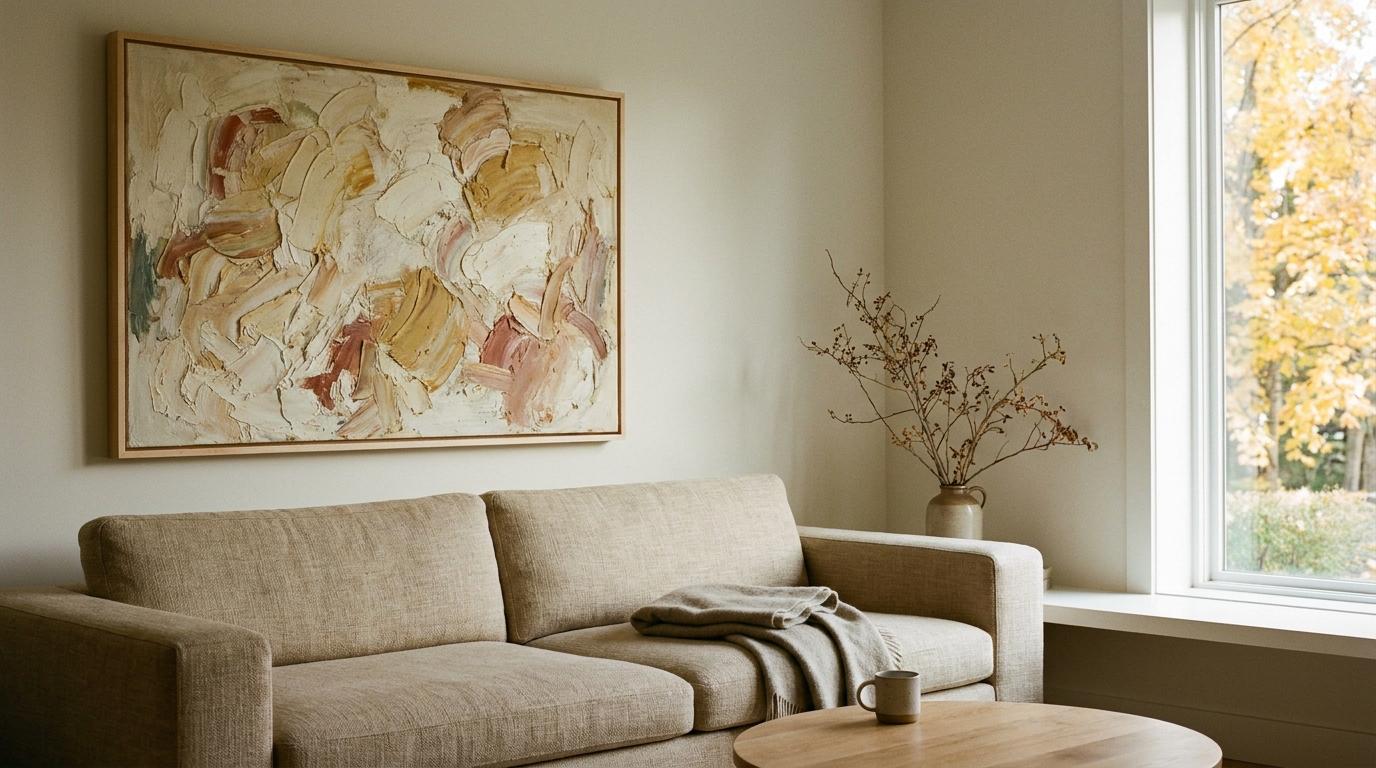
If you have a large, dominant piece of art, you can use tonal color blocking to create an immersive experience. Instead of matching the wall to the most obvious color in the painting, look for a secondary or tertiary color. For example, if you have a large abstract with a small amount of terracotta in the corner, painting the wall a muted version of that terracotta can make the entire room feel like an extension of the art.
This follows the 60-30-10 design rule: the wall is the 60% (background), the furniture and rugs are the 30% (secondary), and the art is the 10% (accent). By pulling a minor color from the art and using it for the 60% wall, you create a cohesive loop that leads the eye back to the painting.
Earthy grounding tones for landscapes
Landscape paintings, especially those done en plein air, often look best against colors that appear in nature. Muted greens and browns provide a grounding effect that complements the organic shapes in the art. Avoid "mint" or pastel greens, as these can look juvenile and compete with the sophisticated greens found in nature. Instead, look for olives or mossy tones like Benjamin Moore Kennebunkport Green. These colors act as a natural extension of the horizon line in the painting, making the frame feel like a window rather than an object hanging on a surface.
Technical Execution: Finish and Placement
Why matte and flat finishes are non-negotiable
The finish of your paint is just as important as the color when you are displaying art. Eggshell, satin, and semi-gloss finishes have a "sheen" that reflects light. If you have a window or a lamp opposite your art wall, an eggshell finish will create a literal reflection on the wall itself. This creates a "halo" of glare around the frame that pulls the eye away from the art.
Flat or matte finishes absorb light. This creates a smooth, velvety surface that stays in the background. Modern matte paints, such as the Aura line from Benjamin Moore or the Emerald line from Sherwin-Williams, are now scrubbable and durable, so you no longer have to worry about the "chalky" texture of older flat paints. For the best background for art, always choose the lowest sheen possible.
The transition zone: mats and frames
The wall color must harmonize with the frame's undertone. A silver or chrome frame on a very warm, beige wall can look mismatched because the cool metal clashes with the yellow in the paint. Conversely, a warm wood frame on a cool, blue-gray wall can feel jarring.
When hanging art, follow the 57-to-60 inch rule: the center of the artwork should be roughly 57 to 60 inches from the floor, which is the standard human eye level. Additionally, ensure your art occupies about 50% to 60% of the horizontal wall space. If the piece is too small for the wall, the wall color will swallow it, no matter how perfect the hue is. In these cases, use a larger mat or group multiple pieces together to create a "mass" that can stand up to the wall color.
Complete Gallery Wall Preparation Checklist
Before opening a single can of paint or driving a nail into the drywall, ensure you have all essential surface prep materials, lighting specifications, and hanging hardware.
Essential Surface & Painting Supplies
☐ Low-Sheen/Matte Topcoat Paint: Selected based on LRV calculations.
☐ Deep-Tone Tinted Primer: Required if transitioning from a light wall to a low-LRV dark color.
☐ Spackling Compound & Flexible Putty Knife: For filling previous nail holes and smoothing drywall dents.
☐ Medium (120-grit) & Fine (220-grit) Sanding Sponges: To create a perfectly smooth wall surface free of sheen bumps.
☐ Painter's Masking Tape (Delicate/Multi-Surface): Sharp lines prevent bleeding along trim, ceilings, and baseboards.
☐ Microfiber High-Density Roller Covers (3/8-inch nap): Ensures uniform matte application without leaving stipple patterns or streaks.
Art Mounting & Protection Gear
☐ Laser Level or 4-Foot Bubble Level: Ensures perfectly straight hanging along the 57-to-60-inch eye-level line.
☐ Stud Finder & Heavy-Duty Wall Anchors: Toggle bolts or metal expansion anchors rated for 30+ lbs for large framed works.
☐ Brass Picture Hangers & Steel Wire: Dual-pin brass hangers minimize wall damage while holding frames securely.
☐ Clear Silicone Frame Bumpers: Placed on the bottom rear corners of frames to protect fresh matte paint from scuffing and keep art level.
☐ White Cotton Art Gloves: Prevent oil transfer from skin onto matting, art glass, or varnish during rehanging.
Recommended Lighting Equipment
☐ 90+ CRI (Color Rendering Index) LED Bulbs: Essential for accurate color perception across all oil and acrylic pigments.
☐ 2700K – 3000K Warm Temperature Lighting: Matches residential atmospheres without turning paint cold or gray.
☐ Battery- or Hardwired Dimmable Picture Lights: Focuses illumination on the canvas, allowing low-LRV background walls to recede into soft shadow.
Items to Avoid ✗
✗ High-Sheen Paints (Semi-Gloss, Satin, Gloss): Create distracting light reflections that obscure the artwork.
✗ Untinted Pure White Ceiling Paint: Casts a clinical, gray-blue shadow under standard residential lighting.
✗ Single-Point Adhesive Picture Hangers: Risk falling off matte paint surfaces over time and damaging expensive art.
Core Color Matching Rules & 5 Critical Mistakes to Avoid
Selecting the right wall color to showcase artwork is an exercise in visual hierarchy. When the background wall competes with the canvas, the viewer's brain experiences visual fatigue, causing the art to lose its intended presence. To ensure your paintings remain the undisputed focal point, follow these core matching principles and avoid five common display mistakes.
The 4 Golden Rules of Gallery Color Matching
1. The 60-30-10 Color Ratio Rule:
Treat your wall paint as 60% of the room's color weight (background backdrop), large furniture or rug elements as 30% (secondary structure), and the artwork as the 10% accent (vivid highlight). The backdrop must remain secondary to allow the 10% accent color to pull forward.
2. The Secondary Undertone Extraction Method:
Never pick the primary or background color of a painting for your wall. Instead, identify a minor accent color—such as a small streak of ochre in a stormy landscape or a soft blush highlight in a portrait—and select a muted version of that hue for the wall.
3. The LRV Contrast Gap (Minimum 30-Point Spread):
Calculate or check the Light Reflectance Value (LRV) of your wall paint relative to the primary tones in your artwork. Ensure there is at least a 30-point LRV difference between the wall color and the predominant shades of the painting so the canvas does not bleed into the background.
4. The Frame Undertone Alignment Rule:
Match cool-toned wall paints (cool grays, blues) with silver, dark iron, or black frames. Pair warm-toned wall paints (creams, warm greiges, terracottas) with natural wood, brass, or traditional gold leaf frames to prevent temperature clashes along the frame boundary.
5 Critical Design Mistakes That Ruin Artwork Display
Mistake | What Happens | The Professional Correction |
Using Untinted "Ceiling White" | Home LED lights (2700K-3000K) bounce off untinted white, casting a cold, dull gray shadow that washes out delicate watercolors and sketches. | Switch to a warm gallery white with micro-pigments of yellow or gray (e.g., Benjamin Moore White Dove or SW Alabaster). |
Matching Wall Color to Dominant Art Color | Painting the wall the exact hue as 70%+ of the canvas causes the artwork to blend into the drywall like camouflage. | Choose a complementary color from the opposite side of the color wheel, or select a backdrop 2–3 shades lighter or darker. |
Choosing Eggshell or Satin Sheen | Higher sheen levels create bright light reflections and halos around frames when room lamps or windows align with the wall. | Always specify Flat or Matte finishes. Modern scrubbable matte paints provide zero sheen glare with full durability. |
Neglecting Mat Board Separation | Hanging art directly against patterned wallpaper or high-contrast walls causes visual clutter along the art border. | Add a solid 3- to 4-inch neutral mat board (white, off-white, or charcoal) to act as a visual "palate cleanser" between art and wall. |
Ignoring Bulb Color Temperature (CRI/Kelvin) | Standard low-CRI bulbs distort paint pigments, turning navy walls muddy green or warm whites sickly yellow. | Use 90+ CRI LED bulbs rated between 2700K and 3000K to ensure true color rendering across wall and canvas. |
Expert tips & Pro Moves
Tip 1: The lighting temperature hack: Always match your paint swatches to your bulb temperature. If you use 2700K bulbs, your paint will look more yellow. If you use 4000K bulbs, it will look more blue. Check your swatches at night under your actual lights before committing to a gallon.
Tip 2: The mat board buffer: If you are hanging art on a busy wallpaper, use an oversized, solid-colored mat board. A three-inch or four-inch white or cream mat creates a visual "palate cleanser" that separates the art from the pattern of the wall.
Tip 3: The frame-to-wall contrast: If you use a flat or matte wall finish, try using a frame with a slight sheen, such as satin brass, polished black lacquer, or waxed wood. This creates a professional-grade separation between the "receding" wall and the "advancing" frame.
Tip 4: Avoid the dominant match: Never paint a wall the same color as the most dominant shade in the painting. If the painting is 80% forest green and you paint the wall forest green, the art will be camouflaged. Choose a color that is at least two shades lighter or darker, or a complementary color from the opposite side of the color wheel.
Paint Color Palettes & Alternative Wall Backdrops By Art Style
Selecting the right backdrop depends heavily on the visual medium, contrast goals, and room conditions. Below are tested paint color variants across major brands, alongside alternative wall treatments for collectors who prefer texture over flat paint.
Top Paint Brand Formulas by Color Category
1. Warm Gallery Whites (LRV 80–85)
- Benjamin Moore White Dove (OC-17): Soft yellow-gray undertone. Ideal for eclectic gallery walls and mixed-media art.
- Sherwin-Williams Alabaster (SW 7008): Creamy, warm white with balanced beige notes. Perfect for modern oils with heavy gold frames.
- Farrow & Ball Pointing (No. 2003): Warm, fresh chalky white designed for traditional living rooms and watercolor pieces.
2. Low-LRV Moody Jewel Tones (LRV 5–15)
- Farrow & Ball Hague Blue (No. 30): Deep blue-green hybrid that makes yellow, red, and metallic gold pigments pop visually.
- Benjamin Moore Hale Navy (HC-154): Classic deep navy with cool undertones. Outstanding contrast for neon abstract acrylics.
- Sherwin-Williams Bronze Red (SW 6328): Deep terracotta/crimson hue ideal for Renaissance-style oils and classical portraiture.
3. Mid-Tone Neutral Greiges (LRV 40–55)
- Sherwin-Williams Anew Gray (SW 7030): Balanced greige that highlights white mats on black-and-white photography.
- Benjamin Moore Revere Pewter (HC-172): Warm gray with green undertones; prevents fine line charcoal drawings from looking lost.
- Behr Studio Clay (PQS-15): Muted taupe ideal for architectural sketches and woodblock prints.
4. Grounding Earth Greens (LRV 20–35)
- Benjamin Moore Kennebunkport Green (HC-123): Olive-toned historical green that grounds landscape canvases.
- Sherwin-Williams Evergreen Fog (SW 9130): Soft sage-gray green that supports botanical prints and natural wood framing.
Non-Paint Wall Alternatives Comparison
When paint alone does not meet the design requirements, alternative wall backdrops offer distinct aesthetic and functional advantages.
Backdrop Alternative | Visual Impact | Acoustic / Display Benefit | Ideal Art Style |
Matte Paint (Baseline) | Clean, seamless color field | Minimal acoustic dampening; easy picture hanging | All mediums (Oils, Prints, Photos) |
Linen Wallcovering | Rich tactile texture | High acoustic absorption; masks nail holes | Minimalist line art, charcoal, sculptures |
Dark Wood Paneling (Walnut/Oak) | Historic, masculine warmth | High structural strength for heavy frames | Classic oil portraiture, brass-framed art |
Lime Wash / Roman Clay | Organic, subtle cloud-like movement | Velvet-matte visual depth | Contemporary abstracts, oversized canvases |
Grasscloth Wallpaper | Heavy woven texture | Excellent warmth; adds organic dimension | Folk art, pottery displays, heavy wood frames |
Frequently Asked Questions
Should I paint my walls dark or light for art?
Light walls offer a modern gallery feel and make a room feel larger, which is ideal for eclectic gallery walls. Dark walls create a dramatic, luminous effect that makes individual pieces and gold frames pop. Darker backgrounds use simultaneous contrast to make the pigments in the art appear more vivid and intense.
What is the best white paint for a gallery wall?
Avoid "pure" or "ceiling" whites. Instead, use warm whites like Sherwin-Williams Alabaster or Benjamin Moore White Dove. These colors have enough pigment to look intentional and soft under residential lighting, avoiding the cold, blue-gray "refrigerator" look that occurs with untinted white paints in a home setting.
Does wall color affect how we see the colors in a painting?
Yes, background colors shift our perception of the canvas. A dark background makes light colors appear brighter and more luminous. A cool-toned wall can make warm colors in a painting seem even warmer. This is why testing a paint swatch behind the actual artwork is a vital step in the selection process.
What finish of paint is best behind artwork?
Flat or matte finishes are the only professional choice for art walls. Higher sheens like eggshell or satin reflect light and create distracting glares or "halos" around the frames. A matte finish absorbs light, allowing the wall to recede and the artwork to remain the primary focus of the viewer.
How do I choose a wall color for a colorful abstract painting?
You have two successful paths: pick a minor accent color from the piece for a cohesive look, or use a deep, neutral charcoal. A dark neutral provides a "stage" that allows the bright, varied colors of an abstract to glow without the wall competing for the viewer's attention.
Can I hang art on wallpaper?
Yes, but it requires a visual break. Use an oversized, solid-colored mat (at least 3 inches wide) and a substantial frame. This creates a "buffer zone" that prevents the detail of the artwork from getting lost in the repetitive pattern of the wallpaper.
How do I choose a wall color if I have an eclectic gallery wall with multiple art styles?
Stick to a warm gallery white (LRV 82-85) like Benjamin Moore White Dove or Sherwin-Williams Alabaster. A clean, warm white acts as a neutral canvas that unifies varying mediums, colorful frames, and diverse subject matter without visually crowding the wall.
What wall color works best for gold or gilt antique frames?
Deep jewel tones with low LRVs (under 15)—such as navy, dark teal, or forest green—make gold and gilt frames pop dramatically. The dark backdrop absorbs excess ambient light, allowing the metallic sheen of the frame and the vivid tones of the painting to glow.
Closing
Choosing the right wall color for your artwork is a move from passive decorating to active curation. By understanding that your walls represent 60% of your room’s visual weight, you can stop treating them as an afterthought and start using them as a tool to improve your collection's luminosity. Whether you opt for a receding dark jewel tone or a warm, breathable white, remember that the finish, matte or flat, is just as vital as the hue itself. Your next step is to grab three large-format swatches of the colors discussed here and tape them behind your favorite piece of art for 24 hours. Watch how the shifting light changes the story of the canvas, and you will see exactly which color allows your art to truly speak.