Turquoise is often unfairly relegated to the realms of coastal kitsch or retro diners, but when executed with precision, it is one of the most sophisticated tools in a designer’s arsenal. Choosing the right turquoise paint living room color requires moving beyond the saturated "Tiffany Blue" stereotypes and embracing the complex interplay of blue and green undertones. The single question most homeowners face is how to harness this bold hue without overwhelming the space or making it feel dated. This guide provides a blueprint for a modern, refined living room, using professional techniques like color drenching and architectural millwork to transform a bright color into a polished atmosphere. We will break down the Light Reflectance Values (LRV), specific paint formulations from heritage brands, and the essential material pairings that ground these aquatic tones in contemporary luxury.
Quick Answer / Key Takeaway
The "Gray" Secret: To avoid a neon effect, always select a turquoise that looks slightly muddy or gray on the paint chip. It will appear as a true, sophisticated turquoise once applied to four walls.
Undertone Mastery: Choose green-leaning turquoises, such as SW Aquaverde, for a warm, organic feel. Select blue-leaning turquoises, like BM Jamaican Aqua, for a crisp, energetic vibe.
Modern Application: Move away from flat drywall accent walls. Instead, use color drenching, which involves painting walls, trim, and ceiling the same hue. You can also apply turquoise to architectural features like built-ins or board-and-batten.
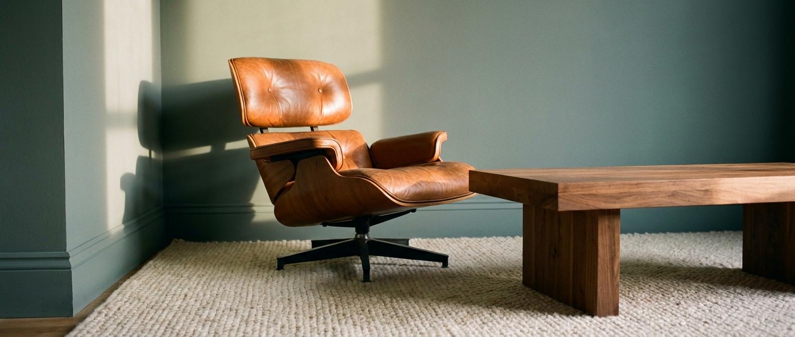
Temperature Balance: Always pair cool turquoise walls with warm elements. Walnut wood, cognac leather, or unlacquered brass prevent the room from feeling sterile.
Turquoise Paint Selection Matrix
Paint Name & Code | Primary Undertone | LRV (Light Reflectance) | Best Style Match |
|---|---|---|---|
Benjamin Moore Wythe Blue (HC-143) | Gray-Green | 48 | Historic / Traditional |
Sherwin-Williams Watery (SW 6478) | Soft Blue | 57 | Refined Coastal |
Farrow & Ball Vardo (No. 288) | Saturated Teal-Blue | 11 | Moody Maximalist |
Benjamin Moore Aegean Teal (2136-40) | Deep Blue-Gray | 25 | Modern Organic |
Sherwin-Williams Aquaverde (SW 9051) | Earthy Green | 54 | Southwest Modern |
The Science of Selection: Undertones and LRV
Turquoise is a chameleon. You must distinguish between a cyan, which is blue-heavy, and a teal, which is green-heavy. Blue-leaning turquoises like Sherwin-Williams Nifty Turquoise (SW 6941) provide a high-energy, retro feel. Green-leaning options like Farrow & Ball Dix Blue (No. 82) feel more vintage and relaxed. The choice depends on your room's orientation. North-facing rooms make turquoise look colder and bluer. South-facing rooms pull out the warmth and make the green tones more prominent.
Light Reflectance Value (LRV) measures how much light a color reflects on a scale from 0 to 100. For a small, dark living room, a high-LRV color like Sherwin-Williams Watery (LRV 57) will bounce light and expand the space. Conversely, a low-LRV shade like Benjamin Moore Aegean Teal (LRV 25) will absorb light. This creates an intimate, jewel box effect perfect for evening-use media rooms or libraries. Understanding this number helps you predict how heavy the color will feel in your specific square footage.
When searching for the best turquoise paint for living room use, avoid the brightest chips. Professional designers look for low-chroma colors. These are colors with significant gray or brown added to the mix. On a small swatch, these look dull or even dirty. However, across 400 square feet of drywall, the color intensifies significantly. A dirty turquoise on the chip becomes a sophisticated turquoise on the wall. This is the most effective way to ensure your turquoise blue paint colors do not look like a child's bedroom.
Modern Application: Beyond the Flat Accent Wall
Color drenching is the most contemporary way to use turquoise. This involves painting the walls, baseboards, crown molding, and even the ceiling in the same shade, such as Farrow & Ball Vardo. Use a matte finish for the walls and a satin or semi-gloss for the trim. This creates a subtle textural contrast. This technique eliminates visual choppiness. It makes small rooms feel infinitely larger and more intentional. It also allows the architecture to speak without being interrupted by white baseboards.
A modern turquoise accent wall should never be just a flat plane of color. Instead, apply the paint to architectural features. Installing vertical shiplap or board-and-batten and painting it a deep turquoise adds depth and shadow. For a more organic, Mediterranean feel, consider a Roman Clay or Limewash finish from brands like Portola Paints. This creates a mottled, suede-like texture. This finish prevents the color from looking flat or plastic-like. The variation in the clay adds a layer of sophistication that standard latex paint cannot achieve.
If painting four walls feels too daring, focus on cabinetry. Use a high-performance coating like Benjamin Moore Advance to paint floor-to-ceiling bookshelves in a striking turquoise. This allows you to keep the surrounding walls a warm neutral, such as BM Swiss Coffee. This provides a massive punch of color that serves as a backdrop for books and art. It turns a functional storage unit into the primary design feature of the room. Color-drenching a living room in turquoise elements like this creates a focal point that feels integrated rather than added on.
Curated Color Palettes for Every Aesthetic
The Southwest Modern palette moves away from the beach and toward the desert. Use muted turquoise paint colors like Sherwin-Williams Aquaverde as the foundation. Pair this with terracotta accents, olive green textiles, and natural walnut furniture. The warmth of the wood and clay balances the coolness of the turquoise. This creates a grounded, biophilic environment. It feels connected to the earth rather than the ocean. It is a mature way to use turquoise living room palettes in a landlocked home.
The Refined Coastal palette avoids anchors and seashells. This palette uses Benjamin Moore Wythe Blue, which is a historic, muted aqua. Pair it with Alabaster White trim and sandy beige upholstery. Incorporate polished nickel hardware and glass elements to reflect light. This version of coastal design feels like a high-end resort rather than a themed cottage. It relies on the softness of the turquoise to create a sense of calm. The gray undertones in Wythe Blue keep the room from feeling too literal or sugary.
For those who love high drama, the Moody Maximalist palette is the answer. Pair a deep, saturated turquoise like BM Aegean Teal with mustard yellow velvet, charcoal gray rugs, and unlacquered brass fixtures. This palette relies on high-contrast complementary colors to create a space that feels historic and tailored. The yellow and orange tones in the brass and velvet provide the perfect foil to the deep blue-green walls. This combination is particularly effective in rooms with high ceilings and original moldings.
Decorating Strategies: Balancing the Bold
To master what colors go with turquoise walls, follow the classic 60-30-10 ratio. If turquoise is your 60 percent on the walls, your 30 percent should be a grounding neutral. Creamy whites or light oaks work best for this. Your final 10 percent should be a high-contrast accent like burnt orange, rust, or brass. This prevents the turquoise from floating without an anchor. It ensures the room feels balanced and professional.
Because turquoise is inherently cool, it must be balanced with warm materials. Avoid pairing turquoise with stark, blue-toned whites or cool-toned marbles. These can make the room feel icy. Instead, opt for walnut, cherry, or white oak woods. Use metals like brass, copper, or gold. For upholstery, choose cognac, camel, or saddle brown leathers. Textiles should include chunky wool, linen, and jute. These natural fibers add a tactile warmth that softens the impact of the turquoise paint living room ideas you choose.
The most common mistake in turquoise living room paint ideas is ignoring the light bulbs. Daylight LED bulbs with a rating of 4000K or higher will make turquoise look like a sterile hospital room. To bring out the rich, green undertones and create a cozy atmosphere, always use Soft White bulbs. Look for bulbs in the 2700K to 3000K range. This warmer light interacts with the green pigments in the paint to create a glowing, inviting space. It is a simple change that completely alters how you decorate turquoise living room spaces.
Avoiding Common Pitfalls
Turquoise is a high-pigment color. This makes it prone to flashing, which is an uneven sheen that appears in patches. When painting built-ins or trim, use a high-adhesion primer like INSL-X Stix. This ensures the topcoat bonds correctly, and the color remains uniform. For walls, always use a premium line like Sherwin-Williams Emerald. These paints have better leveling properties. They ensure the depth of color is consistent across the entire surface. Cheap paint will often require more coats and still look streaky with turquoise.
Never pick a wall to be an accent just because it is the largest. An accent wall must have a purpose. It should frame a fireplace, an alcove, or a gallery wall. If the wall is just a flat piece of drywall with no architectural features, the room will feel lopsided. In these cases, it is better to paint all four walls. Alternatively, you can stick to a neutral wall and use turquoise furniture. This prevents the turquoise paint with gray undertones from feeling like an afterthought.
The scale of your furniture also matters. If you have deep turquoise walls, small or spindly furniture can get lost. You need pieces with enough visual weight to stand up to the color. A large, cream-colored sectional or a heavy oak coffee table provides the necessary presence. This creates a sense of stability in the room. Without these anchors, the turquoise can feel like it is closing in on the occupants.
Expert Tips & Pro Moves
If you have high ceilings, paint them a very pale version of your turquoise wall color. You can do this by asking the paint store to dilute the color by 50 or 75 percent with white paint. This creates a continuous, airy sky effect. It removes the harsh line where the wall meets a white ceiling. This makes the room feel more expansive and professionally designed. It is a trick used in historic European homes to soften the transition of bold colors.
Most people tape paint samples at eye level. Instead, tape them near the baseboards and next to your flooring. The reflection of the floor color significantly changes how turquoise appears. If you have orange-toned oak floors, the turquoise will look bluer. If you have dark gray floors, the green tones will come forward. Testing at the floor level gives you the most accurate preview of the final result.
In a turquoise color-drenched room, use a high-gloss black or deep navy on the interior of the entry door. This provides a sudden, sophisticated snap of contrast. It grounds the room and gives the eye a place to rest. This small detail makes the entire design feel more expensive. It shows that every surface was considered during the planning process.
If the turquoise feels too loud once applied, do not rush to repaint. Add large-scale textures instead. A giant cream wool rug or floor-to-ceiling linen drapes can absorb the visual energy. These neutral blocks of texture break up the color. They provide a visual palate cleanser. Often, the color is not the problem. The lack of contrasting texture is the real issue.
Frequently Asked Questions
What is the best turquoise paint color for a living room?
For a timeless look, Benjamin Moore Wythe Blue (HC-143) is widely considered the gold standard. It has enough gray to feel neutral and enough green to feel warm. This makes it versatile across various lighting conditions and architectural styles. It is a safe but sophisticated choice for those new to the color.
How do you make a turquoise wall look modern?
Avoid the single flat wall approach. Make it modern by using color drenching or by applying the paint over architectural millwork like board-and-batten. Pairing the color with matte black hardware and natural wood also updates the look. The goal is to create depth and texture rather than just a splash of color.
What colors complement turquoise walls in a living room?
Turquoise is best complemented by warm tones. Terracotta, mustard yellow, and cognac leather provide the necessary heat to balance the cool blue-green. For a cleaner look, use creamy whites like SW Alabaster rather than stark, cool whites. These warmer whites prevent the room from feeling clinical.
Should I choose a blue or green undertone for turquoise paint?
Choose a green undertone if you want a cozy, earthy, or vintage feel. This is best for West- or South-facing rooms. Choose a blue undertone if you want a crisp, energetic, or coastal feel. This is best for North-facing rooms that need a boost of clean color to combat gray natural light.
Does turquoise paint make a room look smaller?
It depends on the LRV. A pale, high-LRV turquoise like SW Watery will make a room feel larger and airier. A deep, low-LRV turquoise like F&B Vardo will make the room feel smaller and more enclosed. This is often desirable for creating a moody or cozy atmosphere in a den or library.
What color furniture goes with turquoise walls?
Natural wood like walnut or oak and warm-toned upholstery in cream, beige, or tan are the safest bets. Avoid matching your furniture exactly to your walls. Instead, use the furniture to provide a neutral break for the eyes. This creates layers in the design rather than a monochromatic wash.
Closing
Mastering a turquoise living room is an exercise in balance. You must weigh the coolness of the pigment against the warmth of your textures and the architecture of your space. Whether you opt for a dramatic color drench or a sophisticated, muted accent, the key lies in selecting a shade with enough gray to stand the test of time. Your next step is to grab three samples. Select one blue-leaning, one green-leaning, and one muddy neutral. Observe them in your room’s natural light for 24 hours before making the final commitment. This careful observation ensures that your chosen turquoise will provide the refined atmosphere you desire.