The kitchen is the hardest-working room in the home, yet it is often the most neglected when it comes to genuine artistic expression. Most homeowners settle for mass-produced "Coffee" or "Eat" signs, but the right turquoise kitchen wall art can transform a utilitarian space into a curated gallery. Turquoise is a high-impact choice that bridges the gap between the retro optimism of the 1950s and the sleek minimalism of modern design.
The challenge lies in finding pieces that feel refined rather than generic. You must also ensure they can withstand the unique environmental stressors of a cooking space. This guide moves beyond the catalog fluff to help you source high-quality art from independent creators and install it using professional design principles. We will address the single most important question: how do you balance bold color with the practical realities of heat, grease, and humidity?
Quick Answer / Key Takeaway
Prioritize Material: Opt for UV-filtering acrylic, often called Plexiglas, over standard glass to prevent fogging and shattering in high-heat areas.
Mind the Work Triangle: Keep porous materials like raw canvas or paper away from the stove and sink. Reserve these for dining nooks or pantry walls.
Undertone Matching: Match blue-leaning aqua with cool whites and polished nickel. Pair green-leaning teal with warm woods and brass hardware.
Placement Height: Hang art so the bottom edge is 4 to 8 inches above the countertop or backsplash to maintain a visual connection with the surfaces.
Kitchen Art Material & Placement Matrix
Material Type | Durability | Cleanability | Best Placement |
|---|---|---|---|
Acrylic Framed Prints | High | Excellent (Wipeable) | Near prep areas, above counters |
Raw Canvas | Low | Poor (Absorbs grease) | Dining nooks, away from stove |
Ceramic Plates | High | Excellent (Dishwasher safe) | Directly above backsplash |
Metal Prints | High | Good (Heat resistant) | Near the grease zone |
Glass Framed Art | Medium | Good (Can streak) | Low-traffic pantry walls |
Understanding the Turquoise Spectrum for Kitchen Design
Turquoise is not a monolith. It is a versatile spectrum that dictates the entire mood of your kitchen. Choosing the wrong undertone can make a high-end kitchen look dated or cheap. You must identify whether your space requires the coolness of water or the depth of the forest.
Teal vs aqua kitchen wall decor
The distinction between teal and aqua is critical for color harmony. Aqua is blue-leaning and lighter. People often associate it with coastal or sea-glass aesthetics. It pairs best with cool-toned whites, such as Benjamin Moore Chantilly Lace. This combination creates a crisp, airy environment that feels refreshed and clean.
Conversely, teal kitchen wall decor leans toward green and carries more visual weight. Teal is the superior choice for moody and analogous designs. You can set it against dark navy or emerald green cabinetry to create a jewel-box effect. For example, teal art looks sophisticated against Sherwin-Williams Naval cabinets. This deeper saturation provides a sense of history and permanence that lighter aqua sometimes lacks.
Tasteful turquoise kitchen decor and the 60-30-10 rule
Professional designers use the 60-30-10 rule to prevent bold colors from overwhelming a space. In a typical kitchen, 60% of the room is the dominant color, which usually covers the cabinets and walls. 30% is the secondary color, often found in the floors or a large kitchen island. The final 10% is the accent color.
Tasteful turquoise kitchen decor should represent that final 10%. This provides visual relief from the hard, reflective surfaces of stainless steel and stone without competing for dominance. When you use turquoise as a targeted accent through wall art, it draws the eye to specific architectural features. It breaks up the monotony of a long run of cabinetry without requiring a full kitchen remodel.
Where to Buy Elevated Kitchen Art from Independent Artists
To avoid the big-box look, you must look toward marketplaces that support individual creators. These sources provide original perspectives that mass retailers cannot replicate.
Independent artists turquoise kitchen prints
Sourcing from independent artists ensures your kitchen does not look like a carbon copy of a furniture catalog. For high-quality, non-generic pieces, Minted is a premier resource. Their Fine Art section offers limited edition prints that come with a certificate of authenticity. You can find abstract works that use turquoise in subtle, sophisticated washes rather than literal kitchen-themed illustrations.
Etsy remains a powerhouse for digital downloads of vintage European food advertisements. Look for 1950s French fruit prints with heavy turquoise backgrounds. You can download these files and have them custom-framed to fit your specific dimensions. This approach allows you to control the quality of the paper and the frame, ensuring the final product looks like a gallery acquisition rather than a last-minute purchase.
Where to buy elevated kitchen art for different budgets
The price of art varies significantly based on the medium and the artist's reputation. A printable download from an independent artist might cost $40. When you add professional DIY framing, your total investment stays under $150. This is an excellent entry point for those who like to rotate their decor seasonally.
For those with a larger budget, Saatchi Art offers original commissions and one-of-a-kind paintings. These pieces can range from $200 to over $800. An original oil painting with thick impasto texture can bring a tactile quality to a kitchen that a flat print cannot match. If you seek authentic history, 1stDibs offers mid-century lithographs. These pieces often capture the Stratford Blue era of the 1950s, providing a genuine vintage soul to a modern kitchen.
How to Style Turquoise Kitchen Art Without the Clutter
Placement in a kitchen is more restricted than in a living room. You must work around upper cabinetry, range hoods, and large appliances. Success depends on understanding scale and the relationship between the art and the functional surfaces.
Turquoise wall decor for dining nooks
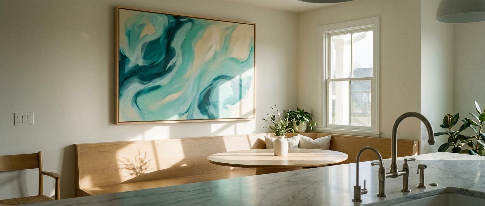
The dining nook is the safest place for larger, more delicate pieces. This is where you can utilize a modern abstract canvas featuring sweeping strokes of teal and aqua. Because this area is typically away from the grease zone, you can opt for float-framed canvases. These frames leave a small gap between the art and the wood, which adds a sense of depth and three-dimensionality to the room.
Scale is the most important factor in a nook. A large empty wall in a dining area demands a piece that is at least 24x36 inches. If the art is too small, it looks lost and unintentional. If you have a particularly long wall, consider a triptych of three smaller turquoise prints. This creates a rhythmic visual flow that leads the eye across the room.
How to style turquoise kitchen art with the open shelving lean
For a cottagecore or boho vibe, use the lean method on floating wooden shelves. Instead of hanging art, you simply rest it against the wall. Place small 5x7 or 8x10 framed turquoise watercolors behind your ceramics or glassware. This layering technique makes the kitchen feel lived-in and collected over time.
To prevent frames from sliding on slick surfaces like marble or polished wood, use a small amount of Quakehold! Museum Putty on the bottom edge. This keeps the art secure even if you accidentally bump the shelf while reaching for a coffee mug. The lean method is also ideal for renters who want to avoid drilling holes into tile backsplashes.
Kitchen Safe Framed Turquoise Wall Art: Protecting Your Investment
The kitchen environment is hostile to paper and canvas. Heat, steam, and airborne grease will destroy unprotected art in a matter of months. Protection is a requirement for longevity.
Wipeable kitchen wall art and glazing choices
Standard glass is heavy and prone to fogging when steam rises from a dishwasher or a boiling pot. Wipeable kitchen wall art should be framed with UV-filtering acrylic. Acrylic is shatter-resistant, which is a safety necessity in a room with hard floors and heavy foot traffic. You can clean acrylic with a mild glass cleaner and a microfiber cloth without the streaking often seen on cheap glass.
Furthermore, ensure the back of the frame has a sealed dust cover. This is a simple paper backing that prevents microscopic grease particles from seeping into the matting and the art itself. Framebridge is an excellent service for this, as they provide custom framing with acrylic glazing and sealed backs as a standard feature. This level of protection ensures your turquoise prints remain as bright as the day you bought them.
Kitchen safe framed turquoise wall art in the grease zone
The area directly above the stove is the grease zone. Hanging unprotected paper or canvas here is a mistake that leads to yellowing and permanent damage. If you want turquoise in this specific spot, you must pivot to functional 3D art. Glazed ceramic plates or shallow bowls are the perfect solution.
You can hang these items with invisible plate hangers. They provide the pop of turquoise you desire but are made of materials that do not absorb odors or oils. If they accumulate residue, you simply take them down and wash them in the sink with dish soap. This keeps your kitchen looking sharp without the stress of maintaining delicate paper goods in a high-heat area.
Tasteful Turquoise Kitchen Decor: Style Archetypes
Turquoise is a chameleon. It adapts to several distinct design movements depending on how you frame and pair it. You must choose an archetype that matches the architecture of your home.
Retro turquoise kitchen art and mid-century optimism
During the post-war boom, brands like GE and Frigidaire popularized Stratford Blue appliances. Today, retro turquoise kitchen art serves as a modern nod to this era. Look for atomic-age geometric prints or vintage beverage advertisements from the 1950s.
To keep the look from becoming a theme kitchen, use clean, modern frames. Matte black or simple light wood frames work best. Avoid distressed shabby chic frames, as these can make the space feel cluttered rather than intentional. The goal is to reference the mid-century era without living in a time capsule.
Aqua blue kitchen prints for desert warmth and coastal crispness
For a desert boho look, pair muted turquoise art with Farrow & Ball Setting Plaster. This dusty pink wall color provides a warm backdrop that makes the turquoise pop. Finish the look with unlacquered brass hardware. The brass will develop a patina over time, adding to the earthy, organic feel of the room.
If you prefer a coastal look, pair bright aqua blue kitchen prints with polished nickel hardware. This combination feels cool and refreshed. Use light white-oak accents for your shelving or bar stools to ground the space. The hardware finish acts as the jewelry of the kitchen, tying the wall art to the cabinetry and making the design feel complete.
Expert Tips and Pro Moves
The Oversized Mat Hack: To make an inexpensive $20 print look like a $200 gallery piece, use an oversized white mat. A mat that is 4 to 6 inches wide creates breathing room around the art. This simple change makes the piece feel more important and professional.
Museum Putty is Mandatory: Kitchens experience constant vibrations from heavy appliances like refrigerators and dishwashers. Use museum putty on the bottom corners of all your frames. This keeps them perfectly level and prevents them from rattling against the wall.
Avoid Kitchen Words: Many designers advocate for treating the kitchen like a living room. Skip the "Bon Appetit" or "Bakery" signs. Instead, opt for landscapes, abstracts, or botanical prints that happen to feature turquoise hues. This makes the space feel more sophisticated.
Visual Connection: Never center art in the space between the counter and the ceiling. It should sit 4 to 8 inches above the surface below it. This ensures the art feels grounded and part of the workspace rather than floating aimlessly on the wall.
Frequently Asked Questions
Is it safe to hang canvas art in a kitchen?
It is only safe if you place the canvas outside the work triangle. This is the high-activity area between the stove, sink, and fridge. Raw canvas is porous. It will absorb airborne cooking oils and moisture, which you cannot wipe away. For canvas in the kitchen, always choose a float frame to provide edge protection.
What colors go best with turquoise wall art?
Turquoise is a cool color that thrives on contrast. It pairs beautifully with crisp whites that have cool undertones. It also looks excellent with warm woods like walnut or white oak. For a bolder look, use complementary colors from the opposite side of the color wheel, such as terracotta, coral, or mustard yellow.
How high should I hang art above a kitchen counter?
A common mistake is hanging art too high. To ensure the art feels integrated into the room's design, the bottom edge of the frame should sit approximately 4 to 8 inches above the countertop or the top of the backsplash. This creates a cohesive visual unit with your workspace.
What is the difference between aqua and teal art?
The difference lies in the base undertone. Aqua is a blue-leaning, lighter shade that evokes a coastal, airy feeling. Teal is a green-leaning, darker shade that feels more sophisticated and moody. Choose aqua for high-contrast white kitchens and teal for warmer, wood-heavy or dark-toned kitchens.
How do I protect framed art from kitchen grease?
The best protection is a combination of UV-filtering acrylic glazing and a sealed dust cover on the back of the frame. Unlike glass, acrylic is easier to wipe down without leaving streaks. Ensure the frame is made of metal or finished wood, as these materials will not warp from kitchen humidity.
Can I put wall art directly above my stove?
It is highly discouraged to hang framed paper or canvas directly above a stove due to the intense heat and grease. This area should be reserved for heat-resistant materials. Consider decorative tile, metalwork, or glazed ceramic plates that you can easily clean in a sink or dishwasher.
Closing
Integrating turquoise kitchen wall art is a sophisticated way to break the monotony of hard surfaces and neutral cabinetry. By selecting pieces with the correct undertones and prioritizing protective materials like acrylic glazing, you can create a space that is both beautiful and durable. Your next step is to audit your work triangle. Identify a wall space at least five feet away from the stove, measure for a 4-to-8-inch clearance above the counter, and begin sourcing a piece that reflects your personal style. Moving away from kitchen clichés allows your personality to shine in the most important room of the home.